Learning CenterWhat is a mineral?The most common minerals on earthInformation for EducatorsMindat ArticlesThe ElementsThe Rock H. Currier Digital LibraryGeologic Time
搜索矿物的性质搜索矿物的化学Advanced Locality Search随意显示任何一 种矿物Random Locality使用minID搜索邻近产地Search Articles搜索词汇表更多搜索选项
╳Discussions
💬 Home🔎 Search📅 LatestGroups
EducationOpen discussion area.Fakes & FraudsOpen discussion area.Field CollectingOpen discussion area.FossilsOpen discussion area.Gems and GemologyOpen discussion area.GeneralOpen discussion area.How to ContributeOpen discussion area.Identity HelpOpen discussion area.Improving Mindat.orgOpen discussion area.LocalitiesOpen discussion area.Lost and Stolen SpecimensOpen discussion area.MarketplaceOpen discussion area.MeteoritesOpen discussion area.Mindat ProductsOpen discussion area.Mineral ExchangesOpen discussion area.Mineral PhotographyOpen discussion area.Mineral ShowsOpen discussion area.Mineralogical ClassificationOpen discussion area.Mineralogy CourseOpen discussion area.MineralsOpen discussion area.Minerals and MuseumsOpen discussion area.PhotosOpen discussion area.Techniques for CollectorsOpen discussion area.The Rock H. Currier Digital LibraryOpen discussion area.UV MineralsOpen discussion area.Recent Images in Discussions


Mineral PhotographyPlaying around with Light and Background

5th Nov 2011 10:25 UTCVolker Betz 🌟 Expert

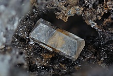
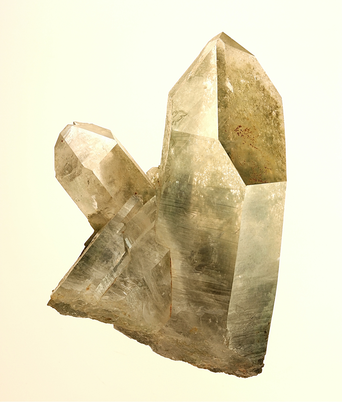
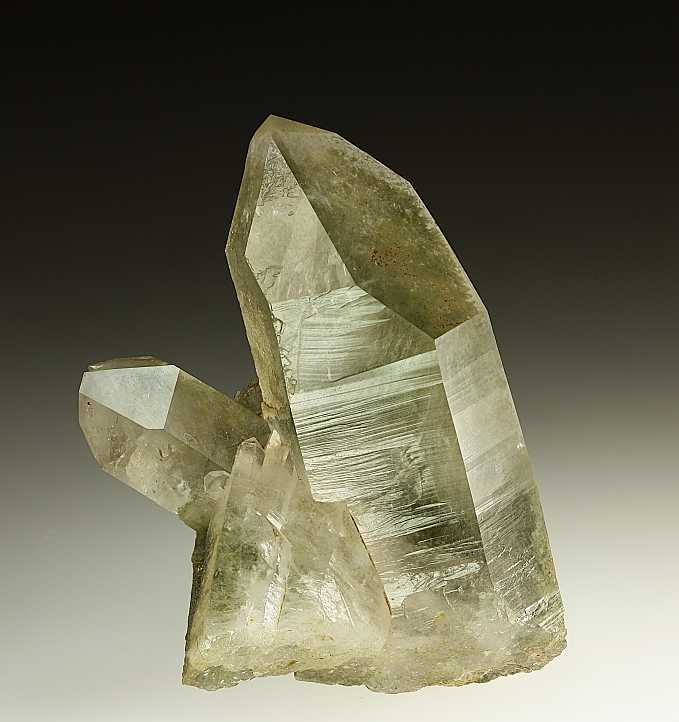
Recently I improved (I hope so) my table top arrangement in order to have space also for larger specimens. This can be used in several ways. One ist with a repro stand for vertical use on top with ( reflecting) glass or some types of, mostly white, acryl glass. I use a Canon EOS 450 with a Canon EF-S 60 mm f/2.8 Macro Lens. All new pictures are a stack of 4-5 pictures with F=8 and exposure times from 1/20 sec. to 1/60 sec. Automated stacking with Helicon Remote.
I made, always from the same Rock Crystal specimen, a couple of pictures with variation of illumination and background.
Specimen size is 3.5x5 cm.
Normally I use black background (a black cloth in 30 cm distance below the glass surface) white background (back lighted opaque or semi transparent acryl glass). The arrangement also allows coloured or colour spotted backgrounds by either using colored sheets with spot lights or coloured foils below white backlighted acryl glass.

As before no reflection on prism

Blue spot in black background

Red background with spot

Green background with spot

Light green background (foil below back lighted white acryl glass
Variations of white background:

Pale, almost white background, version 1

Pale, almost white background, version 2
Pale, almost white background, version 3

White background
and at last

Version posted 2 years ago
All backgrounds are photographed together with the specimen (not replaced with software)
Which version do you like most, and for what reason ?
Volker
5th Nov 2011 12:14 UTCKeith Compton 🌟 Manager
I'm impressed
Well done (tu)
Cheers

5th Nov 2011 12:28 UTCBecky Coulson 🌟 Expert
5th Nov 2011 13:50 UTCRolf Brandt

5th Nov 2011 21:44 UTCRock Currier Expert
5th Nov 2011 23:16 UTCVolker Betz 🌟 Expert
I ask because I know how I see pictures, but I am interested to learn how others see pictures and what is important for the viewers. Making pictures from the lightning setup is more difficult than making the pictures, but I am working on that.
Background is often a weak part of pictures in mindat, so an article could help. Therefore I would like what kind of background style attracts.
Most are attracted by the color of minerals, but if there is only shape and no or pale color, what can be added to the picture to to make it interesting for the non-experts ? Crystal-drawings ?, color spots ? captions ?
Volker

6th Nov 2011 01:42 UTCMalcolm Southwood 🌟 Expert
I find your series of photographs very interesting, largely because I am (gradually) trying to learn how to take decent photos of some of my own specimens.
I found the "blue spot in black background" particularly pleasing but, as a scientist, I'm inclined to agree with Becky in that the background artistry risks misleading the eye as to the merits of the specimen itself. I would therefore go with the "pale almost white version 2" picture, which I feel gives me the most objective sense of what this specimen would be like if I had it sitting in front of me.
You should keep in mind that my wife considers me to be the least artistic person she's ever met so, with that in mind, I'd not be at all surprised if others disagree. I guess to some extent the answer will depend on what the picture is to be used for.
mal

6th Nov 2011 02:57 UTCDebbie Woolf Manager
:)

6th Nov 2011 05:51 UTCDominik Schläfli Expert
i'm not really happy with any of them: the uniform neutral ones look dull, the colored ones tacky. one category of backgrounds is missing in your test, the low saturation colored background: see Amir Akhavan's lightly smoked quartz photos (Thomas Schüpbach also gets it right. for examples of what not to do , see jose manuel sanchis or stefan weiss). A small dash of complementary color is sufficient to enhance the contrast with the mineral. a wider variety of gradients is also worth exploring and showing. the spot on the apex is one of the less subtle aproaches.
best regards,
Dominik
6th Nov 2011 13:09 UTCBecky Coulson 🌟 Expert
6th Nov 2011 16:33 UTCRobert Simonoff
A few things I wanted to point about the pictures in general that affects my thoughts of them regardless of the background coloring and highlights:
Consider "Black background (black cloth) in 30 cm distance" and "As before no reflection on prism." As you point out, one has a light reflection on the main prism. Some of the colored pictures have the light on the front prism and others don't. I personally feel that the light reflecting on the front prism takes away from the piece a great deal. My goal in looking at a picture is to get as much a feeling about the mineral as possible, so anything that takes away from that is less desirable.
In "Black background (black cloth) in 30 cm distance" you can see the bottom of the mineral clearly, but in "Green background with spot" you can't. I prefer the lighting to show the while piece.
Comparing "As before no reflection on prism" and "Red background with spot" you can see a vertical transparent area in the Red one and not the other. I like see that this exists, I think it helps me get a much better feeling for the piece. There are two factors that come into play here. Some of the pictures it is caused by a slight rotation of the piece and in other pictures it is the glare off the front prism face. In either case, I prefer to see the clear spot.
On to the specifics (I will try not to repeat the points above)
Black background (black cloth) in 30 cm distance:The background is fine for me. This picture does suffer from some of the points mentioned above
As before no reflection on prism: The color contrasts enough with the quartz and inclusions that I feel like I can see everything well, given the general comments at the top.
Blue spot in black background: The color contrasts enough with the quartz and inclusions that I feel like I can see everything well. The spot doesn't bother me as long as I can see the details of the mineral. I would prefer the issues mentioned at the top to not detract, however.
Red background with spot: I debated as to whether the "artsy" background bothered me, but I don't think it does. This does show the form of the included chlorite (?) much better that the green background because the background color is dissimilar to the chlorite. It shows that there are areas with more chlorite and areas with less, and the background highlights their shape.
Green background with spot: After looking at this and the red one side by side, I realized that the included material (chlorite?) is not just a transparent cloud, but has internal shape, form and clear areas. You can't really see that in this photo as dramatically, since the background color is so similar. I do prefer to see these details.
Light green background (foil below back lighted white acryl glass: The included chlorite does not stand out as much with this background.
Pale, almost white background, version 1: The background color seems to take away from the mineral. I feel like I have to work harder to see the mineral. It seems to get lost.
Pale, almost white background, version 2: The effect of losing the mineral in the background is greatly reduced as compared to "Pale, almost white background, version 1" for me.
Pale, almost white background, version 3: Elicits a finger nails on the chalkboard type of feeling or that feeling you get when two adjacent keys on a piano are struck. :-)
White background: Suffers the same as "Pale, almost white background, version 1" for me.
Version posted 2 years ago: Suffers the same as "Pale, almost white background, version 1" for me, but in an opposite way.
So...
I think my favorite would be:
The blue background, rotated to show the clear area and no reflection on the front prism face
The red background with a little more light to show the bottom
Pale, almost white background, version 2 if rotated and had no reflection on the front prism face
I would need to see these variants to know which I liked best among them
Bob (not the artist in the house)
6th Nov 2011 19:03 UTCVolker Betz 🌟 Expert

Thank you very much for the interesting comments. I work on a website to show the modified setup I am using now for "whole specimen" photography.
In the mean time for Dominik:

Pyrite, black only
Is this a version you have in mind ?
I look forward for further comments. My personal preference is to show the features of a mineral and its shape. But it is important for me to know what viewers have in mind looking on a picture. " Extra" colors in a picture is not my preferenece, but I recognized that it plays a role and i like to understand this.
It looks like that some see first colors and then shapes. Recognizing shapes without color seems to be more difficult.
Regards
Volker

6th Nov 2011 19:55 UTCJolyon Ralph Founder
Why?
Because I have been testing for some time technology to search for similar photos - so if you like one particular photo the system can find similar photos (not necessarily the same mineral, but photos that are visually similar).
These coloured background spots really mess this up, and so far this is one big reason why such as system doesn't work very well on mindat.
Jolyon
6th Nov 2011 21:35 UTCMichael Shaw Expert
Personally, I prefer the last photo on the black background. To me, what makes this specimen special is the chlorite inclusions. Many of the photos do an adequate job of showing the shape, quality of the crystal faces, etc., but the last photo does the best job of allowing one to see into the prism and view the inclusions.
Michael
6th Nov 2011 21:38 UTCRock Currier Expert
I tend to look at mineral picture and try and understand what the mineral actually is and looks like, even if it is a ratty picture. A ratty picture of a great specimen does not make it any less of a great specimen. I tend to think that many specimen photographers try and make their specimens look better than they really are and try and bend the image to achieve that goal. Photoshop can do wonders for the way a specimen looks, but personally feel that its users usually over do it. But that's the way people are. We usually try and make things look better than they really are. A lady with make up and high heals and a snug sweater usually looks better to guys than one without. We can't help ourselves that's just the way we are built. That's why we clean mineral specimens and trim them after all. But how much enhancement is enough. How much fiddling with the colors in the back ground or the spectra of incident light or how much back lighting is permissible? The answer of course is that it varies with each person that looks at the picture. Add to that the variability of the way that our monitors show the images we put up on the net and I don't think that individual comments about which of several images of a particular specimen they like best has a lot of meaning. Is the best we can do a popularity contest? Perhaps it is. At any rate I think your pictures are fine.

7th Nov 2011 03:00 UTCDouglas Merson 🌟 Expert
For me it is toss up between the first and last quartz photo. The first as it shows the surface detail on the prism face and the last as it best shows the internal features. I am not a fan of colored spots.
Doug
7th Nov 2011 09:15 UTCVolker Betz 🌟 Expert
your comment is intersting. In fact I am not a big fond of coloured spots but it looks like that this kind of "make up" works if the picture or specimen or both is else not so appealing.
My question now: Do fading backgrounds the same mess with the search technology ?
Volker
7th Nov 2011 12:57 UTCJolyon Ralph Founder
Jolyon
8th Nov 2011 20:33 UTCVolker Betz 🌟 Expert
thank you ver much for your comments. They are helpful to teach me, that there are different ways to look at a mineral picture.
I can very well understand that you mainly see the specimen, its the way you are and have been sucessfull in the business. Take its as a compliment even I am not able to express that this way. Also understand that for me the specimen is only a vehicle to make a picture which expesses what I like to show. For that case I dislike (or to say it politcally incorrect: HATE) pictures of good specimens which are (technically) bad made. A photograph is a not only a documentation of any existing piece, it adds and carries the impression and and intention of the photographer,( if he has such ideas in mind). To make a specimen picture like at it is, without any enhancement is ...... I am not able to expess that well in english, at least boring..
The conclusion for me: A good specimen will not always make a good picture, but a good photographer can make a good pictures from a suitable anything. For me: If a spceimen looks like ist is in a photograph, its fine, but it may be look better.
Look a t the many pictures of women celebrities - it´s the way we are. Title pages sell.
Volker


版权所有© mindat.org1993年至2024年,除了规定的地方。 Mindat.org全赖于全球数千个以上成员和支持者们的参与。
隐私政策 - 条款和条款细则 - 联络我们 - Report a bug/vulnerability Current server date and time: 2024.4.18 18:41:41
隐私政策 - 条款和条款细则 - 联络我们 - Report a bug/vulnerability Current server date and time: 2024.4.18 18:41:41